Btw, @shinyoukai@neko.laidback.moe, that’s a super cool logo on your yarnd. I like it a lot!
It just doesn’t look aligned properly: https://lyse.isobeef.org/tmp/misalignment.png Could be a yarnd issue, though, it might not expect a logo this large. Just wildguessing, no idea.
the new logo is cute 
↳
In-reply-to
»
New beginnings, new horizons. New pod logo 🤟 Media
⤋ Read More
@prologic@twtxt.net this one? https://twtxt.dev/assets/img/twtxt-logo.svg Other than being “circlish” I don’t see any relationship. 😅
↳
In-reply-to
»
New beginnings, new horizons. New pod logo 🤟 Media
⤋ Read More
@prologic@twtxt.net I prefer something like the logo on https://twtxt.dev, for example, instead. But hey, it is your pod, have fun!
↳
In-reply-to
»
New beginnings, new horizons. New pod logo 🤟 Media
⤋ Read More
@lyse@lyse.isobeef.org @bender@twtxt.net that’s also what Yarn.social’s logo is, and just happens to be the yarnd default. Hmmm figured times for a change? 🤔
New beginnings, new horizons. New pod logo 🤟 
New beginnings, new horizons. New pod logo 🤟 
Design trends I think will take off in 2026
but tierlist

S - move from flat design to more detailed, 3D, more complex logos.
A - glass, not just liquid, Windows Vista, 7, 11,… accessibility concerns, but I like to see it.
B-/C+ - black and white icons, favicons. I did it before it was cool, but it’s getting overused.
E - gradientslop, barely started, already all blends together.
search page, bookmarks page, improved thread view (that i will probably improve further), as well as a logo and a whole ui redesign. it is truly all coming together…were i to mark any items off the roadmap :p
↳
In-reply-to
»
This is something that @kat might enjoy:
⤋ Read More
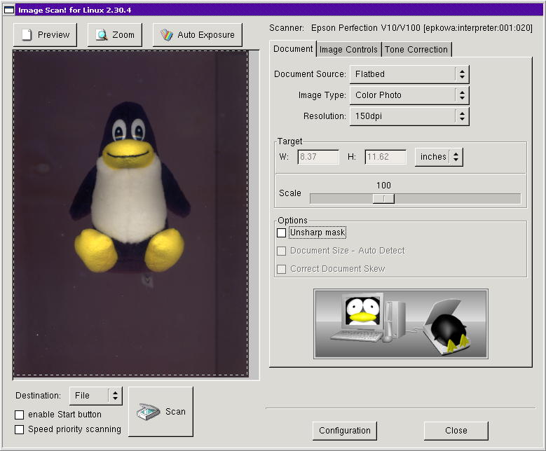
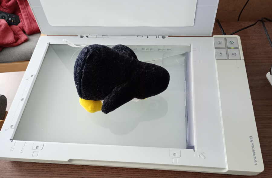
@lyse@lyse.isobeef.org Best logo ever made. 😅 (It’s partially proprietary software. Just for Epson scanners, I think? Not sure.)
↳
In-reply-to
»
This is something that @kat might enjoy:
⤋ Read More
@movq@www.uninformativ.de Hahaha, great idea! :-D I never saw the Epson Image Scan logo before.
This is something that @kat@yarn.girlonthemoon.xyz might enjoy:
Recreating the “EPSON Image Scan!” logo with one of my Tux plushies. 😅
↳
In-reply-to
»
TIL: The logo of
⤋ Read More
sudo is a sandwich. 🫠 https://www.sudo.ws/
@movq@www.uninformativ.de @bender@twtxt.net I never saw that. Neither the website nor the logo. I like the old one more, although I have to admit the story behind the new one is actually really cool: https://www.sudo.ws/about/logo/
TIL: The logo of sudo is a sandwich. 🫠 https://www.sudo.ws/
FRIENDS I GOT A PHYSICAL COPY OF A TUX GAME LOOK AT ITTTTTTTTTT

crowdsec ipdex logo is awesome
PR to Add improved styles for the logo for twtxt.ndev 

AI company logos look like buttholes!
↳
In-reply-to
»
An interesting episode about naming stuff, and some implications of the "Trademarks"
⤋ Read More
In Mexico you couldn’t register the word Sonora (state), nor Taqueria (kind of restaurant) as there are two common words, but perhaps the combination of both is trademarkable, I’m not sure, so many ‘taquerias’ here don’t file a trademark request. It’s usually “Taquería [LAST_NAME]” or “Taquería [PLACE]”.
At the same time, the word “taqueria” was trademarked in UK, like it would be “Paris” or “Pub” I guess, so basically Sonora Taqueria didn’t reply to the cease and desist, based on:
[Lizbeth García]: A brand may not use a word that is generic or descriptive of the products or services it is putting into circulation on the market.
Since he (Ismael, Taqueria’s representative) didn’t get any response, he decided to leave it in the hands of his law firm.
In early 2023, after all the noise on the internet and the mobilization caused by this case, an agreement was finally reached with Taquería to settle the matter peaceably.
In March 2023, Michelle and Sam decided to register the Sonora Taquería brand and logo with the UK Intellectual Property Office.
Avec l’aide de Péhä, j’ai amélioré ma collection de logos #solarpunk. Merci! https://si3t.ch/misc/solarpunk/
I have released new updates to the twtxt.el client.
- Markdown to Org mode (you need to install Pandoc).
- Centred column.
- Added new logo.
- Added text helper.
The new version I will try to finish the visual thread. You still can’t see the thread yet.
#emacs #twtxt #twtxtel
@prologic@twtxt.net Looks great with the new logo.

@aelaraji@aelaraji.com Next release will convert markdown to org syntax if you have Pandoc command installed 😎. Mentions are org links, for example.
The people have spoken! 🥳 twtxt.dev shall have a new logo of: 
What would you like the new twtxt logo to be?
Comments: https://git.mills.io/yarnsocial/twtxt.dev/issues/9#issuecomment-18960

What would you like the new twtxt logo to be?
↳
In-reply-to
»
I would like to make another proposal to the community, to discuss it calmly: https://git.mills.io/yarnsocial/twtxt.dev/issues/9 #twtxt
⤋ Read More
No no! I’m talking about twtxt’s own branding. It’s currently horizontal text. Is the image you’re sharing a logo that’s being used? 😯
↳
In-reply-to
»
Any idea What's this
⤋ Read More
"twtxtfeevalidator/0.0.1" UA about? I thought I could ask before throwing a 1000GB file at it 🪤 could it be the same 'xt' thing @lyse was talking about the other day?
@aelaraji@aelaraji.com Thank you very much, glad you like it. :-) I always try to make web pages use as much semantic tags as possible and keep the HTML very simple, so that they also have a chance to look decent in terminal browsers. The logo took me a few hours to draw in all its three sizes.
↳
In-reply-to
»
Any idea What's this
⤋ Read More
"twtxtfeevalidator/0.0.1" UA about? I thought I could ask before throwing a 1000GB file at it 🪤 could it be the same 'xt' thing @lyse was talking about the other day?
@lyse@lyse.isobeef.org yep, I gave it a spin locally! I freaking love the cute logo and the UI is fiiiine 👌 my TUI browsers love it just as much …

↳
In-reply-to
»
changing my video site's logo to this silly no thoughts head empty tux clip art. because i can. https://openclipart.org/detail/103855/tux-the-penguin
⤋ Read More
@kat@yarn.girlonthemoon.xyz after some fighting with this janky software (that i still love despite the jank) we now have stupid tux as our logo. slayyy
changing my video site’s logo to this silly no thoughts head empty tux clip art. because i can. https://openclipart.org/detail/103855/tux-the-penguin
Anyone good with designing logos? Salty IM needs one fast! 😅
↳
In-reply-to
»
WIP for a new branding and top-navn
Media
⤋ Read More
Awesome! do you have the svg available to add to my logo?
@jlj@twt.nfld.uk @thewismit@twtxt.psynergy.io Custom Pod Logos are now available with PR 358 🎉 if you’d like to checkout this PR on your pods and recompile and let me know how it goes that would be swell 👌